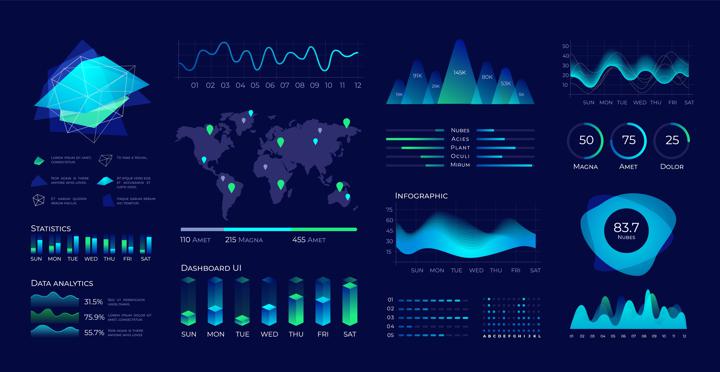
Data visualization has become the go-to option when you want people to see how you are drawing correlations and conclusions. There are multiple reasons for adopting data visualization techniques, with increasing volumes of complex data and lack of time to process such data manually are some of the most obvious ones. From high-level government decision-making to mass media presentations, there is a surfeit of situations wherein one or more data visualization types have been deployed to effectively communicate otherwise difficult to decipher analyses. For example, the ongoing Covid-19 pandemic has been tracked all over the world using a combination of data visualization techniques by different agencies and governments. Equally, the most recent United States presidential election saw media outlets track the results using US map-based data visualization designs.
The increasing demand for data visualization and advancements in data science have catalyzed the evolution of data visualization techniques. Data visualization is no longer a standalone task but is embedded in data analytics platforms or data dashboards that speed up the interpretation of the data. These platforms, including InsightOut, Power BI, and Tableau are just a few examples that cater to today’s globally connected organizations, allowing collaboration across teams and geographies. This also places a premium on data visualization techniques that can speak to a wider, more diverse audience without requiring in-depth tutorials.
In general, the data visualization techniques an organization or team opts for can depend on several factors, of which the audience is most critical. Consumer-facing companies need to keep their analysis simple and easy to understand and cannot risk using complex data visualization designs. However, there may be an incentive for companies willing to innovate and experiment with more eye-catching data visualization techniques, such as three-dimensional, or 3D, data visualization. This, in turn, brings the content and context into the equation as the form of data visualization necessarily needs to follow the function. Akin to storytelling, good data visualization can enrich presentations by providing a strong narrative without sounding monotonous.
However, while a story may not change over time, data visualizations need to be dynamic to accommodate variables such as financial metrics or weather data. Organizations can have different team members accessing the same data during different times, making it essential to ensure that your data visualization technique can be quickly and intuitively updated whenever necessary. Again, the choice of the technique has to be purpose-driven rather than mechanical or for novelty. If your data isn’t too complex, or if you don’t need to generate a large number of insights, you can pick a simpler technique. Equally, some of the traditional data visualization techniques may become unwieldy when working with large data volumes. You may either have to filter the data or combine different data visualization types.
Traditional Data Visualization Techniques
Commonly utilized data visualization techniques usually involve presenting structured data as charts, plots, and maps. The choice of technique and type can boil down to the complexity of the data story that needs to be conveyed. For instance, a line chart can be useful if the only variable of concern is the rate-of-change, whether with time or against another variable. However, a simple line chart can be transformed into a more expressive area chart when comparing more than one data set or dealing with a longer time series. The major data visualization techniques and their types can be summarized below.
Charts
- Bar Charts: When you need to compare values or quantities across categories, you can look at a data table, or you can present it as a bar chart. You can avoid the risk of skipping or misreading a number in a table, as differences in the heights or lengths of the bars are not easy to miss. Bar charts also allow you to present aggregated data, as the bar can be broken up into sections. Again, you can use a progressive bar chart, also called a waterfall chart, to represent data sequentially.
- Line Charts: These charts help visualize the change of one variable against time or another variable, especially when there are a high number of data points. For several sets of data, you can upgrade a line chart to an area chart and compare the differences using, for instance, contrasting colors.
- Pie Charts: These offer a convenient way of comparing breakdowns and percentages but can become visually challenging if there are near equal parts. Turning pie charts into donut charts hasn’t helped address this challenge either. Usually, you’ll need to overlay textual information to make pie charts more understandable.
- Gantt or Timeline Chart: These are used to visualize and track the progress of processes handled in parallel within an organization by multiple stakeholders over the same period.

Plots
- Scatter Plots: Useful for studying correlations, scatter plots involve marking data values on a graph to see how close or distant they are from each other. They are especially useful in statistical analysis to gauge correlation and regression between data variables. Again, it makes more sense to visualize data as a scatter plot when you have a moderately large data volume.
- Bubble Plots: This is a data visualization technique that adds a third dimension to the scatter plot through the size or weight of the bubble. A larger bubble indicates greater intensity or correlation. Bubble Plots are sometimes juxtaposed with geographical maps to depict regional variations and can be animated to illustrate the change in a variable over time.
Maps
- Heat Maps: Among the many ways of visualizing geography-specific data, heat maps can help emphasize the intensity or density of the data variable being measured. For instance, with animation, the growth in the number of Covid-19 cases in a particular region can be visualized.
- Flow Maps: These are used to represent the geographic movement of people or trade. These can be combined with a bubble plot to indicate correlations between pockets of high data density.
Besides these, data visualization techniques like matrices and diagrams have evolved to deal with complexity in data sets, such as a tree diagram for representing data hierarchies. Again, many of these data visualization techniques can be deployed on dashboards via software tools like InsightOut, Excel and Tableau. Data dashboards often present a combination of several different data visualizations, choosing a mix of techniques that help convey the narrative best. Depending on use case, two or more visualizations can be overlaid to present a more comprehensive picture. This may be particularly necessary when dealing with large data volumes or big data(link).
The Big Data Challenge for Data Visualization
Most traditional data visualization techniques work best when dealing with small or moderately-sized, structured data sets with limited time variation. However, the sheer volume of big data sets apart, the fact that big data sets can often be unstructured or semi-structured and can render data visualization a highly challenging exercise. Adding to this challenge is that the data values comprising big data sets are updated more often, generating far more unique data values that defy interpretation. Charting such a data set using, for instance, a bar chart can result in an excessive number of bars which are difficult to distinguish.
The positive is that such challenges have fueled innovations in data visualization techniques. For example, content marketers can use Word Clouds, instead of bar charts or pie charts, to visualize the frequency of words when analyzing usually unstructured consumer feedback or media mentions. Using artificial intelligence (AI) and machine learning algorithms, this analysis may be taken a step further in terms of discovering new word or phrase associations along with the expected inputs. Similarly, a colored correlation matrix can simplify examining data relationships by directing attention towards highly correlated data variables, which would show up in deeper shades.
Auto-charting is one of the major advancements in data visualization enabled by AI algorithms. When data is imported into a dashboard or data visualization tool, the tool carries out its data visualization design and comes up with a suggested data visualization type. You can check if the visualization works for you, given your audience and the context, and either go ahead with the visualization or pick a new one. In doing so, you may be contributing to the algorithm’s education as well.
Irrespective of the size of the data you’re handling or your preferred data visualization techniques, you’ll need to maintain a consistent approach to visualization. There may be great temptation to experiment given the profusion of data visualization techniques and tools, but you can run the risk of confusing your audience if your visualization isn’t intuitively understandable. Worse, they could end up misinterpreting your analysis completely. If you are collaborating with a large team or geographically diverse teams, a lack of consistency can defeat the very purpose of data visualization and instead necessitate detailed explanations every time the data visualization is accessed.
