

This post is part of our 8-part series exploring the role of data in business recovery and planning in the era of COVID-19. Read the rest of the articles here.
For many companies, business continuity management usually involves a series of measures to mitigate business risks stemming from a crisis. By analyzing the impact of past crises on various business areas, organizations can forecast potential crisis outcomes that can disrupt business and plan to minimize such disruptions. Such forecasting and scenario planning is made more efficient using automated insight tools, which leverage a combination of big data and artificial intelligence-based algorithms. However, the COVID-19 pandemic has brought in a whole new dimension to business continuity planning and necessitated agile recalibration of the measures designed to tide over the crisis.
The ongoing nature of the crisis is severely testing businesses' continuity planning tools, especially those that facilitate data-driven decision-making. For most organizations, leveraging data for decision-making is a key differentiator, with the ability to access rich, up-to-date, verified data and derive actionable intelligence as a means for outpacing the competition. Again, from a business continuity management perspective, the insights must be widely and intuitively accessible to enable the rapid execution of crisis responses.
Broadly speaking, the best data analytics tools for business continuity planning are ones that are approachable and don’t require users to know how to code or use specific software. These platforms also have built-in data aggregation to combine internal and external databases meaningfully. At the same time, data platforms need to be collaborative and allow users to define common data metrics across their organization, which is necessary to ensure the insights are relevant and actionable. The most critical feature of today’s top data platforms is perhaps their ability to automate data discovery and business insights delivery.
Different data analytics platforms have gained popularity based on various capabilities such as data gathering and preparation, data manipulation, or data visualization. We explore the top 5, most popular data analytics platforms that are helping business executives and managers embed data into business continuity management.
1. InsightOut
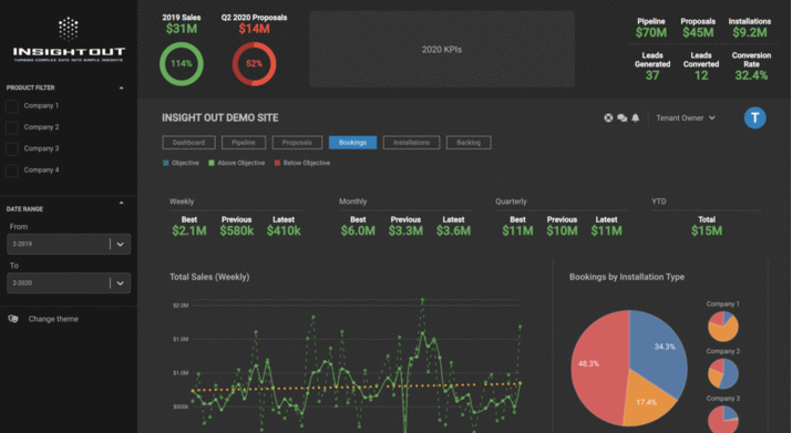
Data-driven decision-making tools such as InsightOut can aid business continuity planning. InsightOut is an end-to-end analytics solution covering the aggregation, preparation, management, analysis, and visualization of data. The platform is designed for business users to independently manage and analyze data in a self-service environment, without reliance on IT. InsightOut can pull in data from disparate sources such as those hosted on Amazon Web Services or siloed in management applications while also allowing users to import custom datasets from Excel. Its automated insights engine derives actionable intelligence, surfaced as powerful visualization on the platform’s customizable dashboards.
Beyond data visualization, InsightOut reaches across existing systems to infuse data throughout the operational workflows unique to each organization. Dynamic reporting, along with adaptive governance protocols, enable and regulate collaboration across the extended enterprise of team members and external stakeholders. The platform places its emphasis on nimble user manipulation of data inputs as well as outputs, with a native Excel add-in that establishes a seamless secure two-way connection with the managed InsightOut data warehouse to support ad hoc modeling and queries.
Organizations can leverage the InsightOut data platform for a wide range of goals central to business continuity management, including:
- Optimizing resources to streamline operations
- Enhancing collaboration among team members and stakeholders
- Mitigating risks via forecasting and scenario planning
- Driving long-lasting business impact using automated insights
2. Power BI

Developed by Microsoft, this proprietary business analytics solution primarily allows users to visualize data aggregated from a wide range of sources. Utilizing a familiar Microsoft Office interface, Power BI allows stakeholders to collaborate at both technical and functional levels, whether for creating or viewing reports, writing back data into existing datasets, developing data visualizations, or sharing insights with other team members. It also supports integration with other tools and data platforms like Microsoft’s Excel, Cortana, and Azure, enhancing data search and management through a single dashboard. With dashboards also available as templates, team members from different business areas can develop relevant dashboards on the fly without needing to customize the platform itself.
Power BI has been leveraged across many business functions, including operations, marketing, sales, and human resources, to track real-time financial performance, customer behavior, etc. In terms of business continuity management, Power BI’s Business Continuity Dashboard, launched in the wake of the COVID-19 pandemic, helps businesses - particularly human resource executives - measure the impact of teams working remotely. It is designed to be used in combination with Workplace Analytics, another Microsoft tool that gathers productivity insights, to answer questions about work-life integration, changes in collaboration, and employee engagement.
3. Tableau
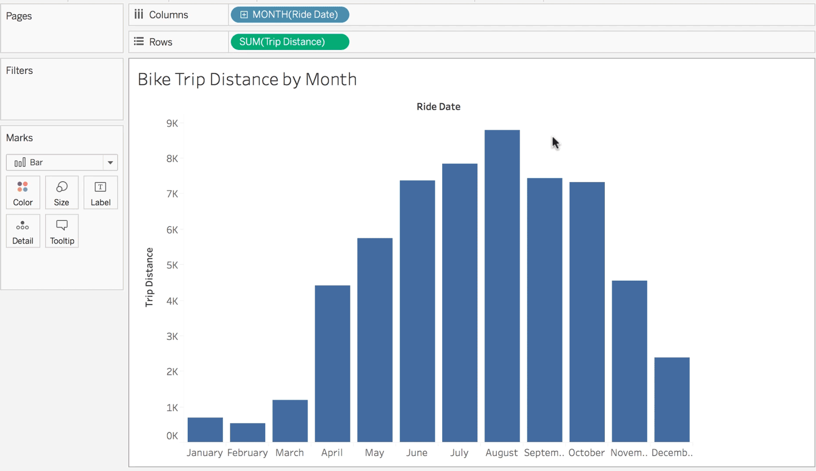
Tableau is another data analytics and visualization tool that is known for its data blending capabilities, besides real-time data analysis and data collaboration. This data platform pioneered the use of data visualization for analyzing business intelligence and is considered particularly useful for big data analysis. The front-end approach to data analysis gives Tableau users the ability to visualize scenarios dynamically. Tableau’s advantages include access to a large number of databases and inbuilt machine learning capabilities. For instance, it is integrated with the R and Python programming language environments, which enables predictive and statistical analysis.
Apart from enabling storytelling through visual reporting of data, Tableau also offers customization for analysts and experienced users. Tableau may also be considered a more total data analytics solution when compared to Power BI which relies on other Microsoft products for critical functions such as data aggregation and querying. The platform also launched a COVID-19 cases starter workbook which includes data from sources like the European Centre for Disease Prevention and Control to assist organizations with business continuity management.
4. Qlik Sense and QlikView

The data discovery and analytics platform Qlik Sense claims to be quicker to deploy and configure while helping businesses convey stories from data effectively. It is a self-service analytics tool and offers convenience for professionals from different business areas with minimum technical knowledge. Qlik Sense’s standout feature is the Qlik Associative Engine, which maps all potential data relationships, speeding up the process of deriving insights. The “associative analysis” offered by the engine is an alternative to querying and can yield unexpected insights. Similar to Tableau, Qlik Sense also offers dynamic data visualization even while using its dashboard. However, it requires application programming interfaces (APIs) to integrate with other platforms or scripting tools.
Interestingly, Qlik Sense came up as an in-house competitor to QlikView which trailed only Power BI and Tableau in terms of completeness of vision and ability to execute in Gartner’s Magic Quadrant 2017. While QlikView heralded some of the features seen in Qlik Sense such as the associative indexing engine, Qlik Sense focuses more on self-service capabilities, data storytelling, and data mining and analytics. Qlik Sense is also targeted at small- and medium-sized enterprises while QlikView caters to larger firms as well. The Qlik Analytics Platform powers the European Centre for Disease Prevention and Control’s COVID-19 website.
5. Databricks/Redash

In addition to data visualization, the evolution of data analytics platforms has also been fueled by the need to crunch insights from big data using advanced machine learning algorithms. Databricks, a unified data analytics platform, answers the need, for preparing big data and simplifying big data. Developed in the same AMPLab at the University of California in Berkeley as Apache Spark, Databricks builds on Spark’s data processing capabilities by using a distributed system. This facilitates scaling up data processing, depending on the volume of the data. Further, the platform relies on a “data lake”, a repository containing structured and unstructured data.
Redash is Databricks’s in-house data visualization and dashboarding tool and offers similar data-driven collaborations as other visualization tools. Further, Delta Lake, the data lake offering from Databricks, can be connected to Power BI, Tableau, and Qlik Sense for optimal data processing and visualization. Both Amazon Web Services and Microsoft Azure include Databricks as an enterprise cloud service. The data processing power offered by Databricks has been leveraged to develop a COVID-19 surveillance solution used by health departments in many American states and hospitals.
Honorable Mention: Microsoft Excel
After looking at these top 5 tools, we should also mention another that we are all very familiar with. Microsoft’s spreadsheet application Excel, which has undergone a significant evolution in terms of utility since it was first launched, also needs to be mentioned in this context. Known for its data formatting and manipulation capabilities, Excel continues to be the go-to tool for creating datasets, and also offers visualization through its inbuilt charting and graphing tools.
Further, users can also enable the Analysis Toolpak to leverage Excel’s analytical functionality. Making full use of Excel, however, requires some knowledge of Visual Basic, programming macros, and enabling external data connections. Excel may be seen as a forerunner, with more advanced visualization tools like Power BI and Tableau being more interactive and intuitive successors.
Excel is convenient to use when dealing with low volumes of structured data, as it does not require much customization or setting up. Some features of Excel such as Pivot Tables offer unmatched value in terms of data analysis. Like Power BI, being a member of the Microsoft product family ensures that Excel can also be integrated with many other applications. Power BI and Excel are also comparable in terms of their data modeling process, which means you can import data models from Excel into Power BI quite easily. That said, for more complex analytical processes and large scale organizations, Excel is limited in its scope of coverage and does not offer the robust, enterprise-level functionalities required for a true data-driven organization.
The utility of each of these tools can vary based on the business’s specific needs and each can help as a tool for business continuity planning in a distinct manner. It has taken a crisis like the COVID-19 pandemic for governments and businesses alike to transform the scale and speed of data processing. It is likely that a future crisis will require a literal quantum leap in terms of the computing power necessary to unveil insights from even larger volumes of data.
For organizations focusing on business continuity management, keeping track of advances in data analytics is now an undeniable necessity.