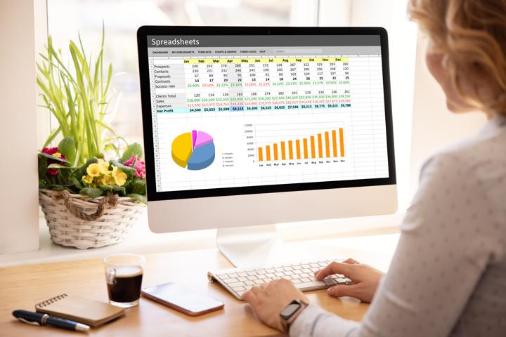
In the business world, the most relevant information is often locked inside reams of data stored in popular data tabulation and analysis software, such as Microsoft Excel.
Excel has matured over time to allow in-ecosystem data calculation and analysis via customizable and in-built formulas. It enables data visualization with its in-built charts feature, including popular chart types like bar graphs, pie charts, histograms, etc. It is also possible to superimpose multiple chart types on the same plot, allowing visualizations to become powerful multivariate analysis tools.
Data Visualization in Excel
Like all data visualization features, the charts feature in Excel boosts reader engagement and understanding of the data. The ability to embed the charts directly over or under the data, especially when dynamic features of Excel charts are enabled, allows users to toggle back and forth between the image and the data at will. Finally, the mutual embedding capability of Excel and other MS Office tools like Word and PowerPoint makes it easy to use the visualization across reports, office presentations, and more.
Excel is a great starting point to create data visualizations. Other more specialized data visualization tools make it even easier to access sophisticated features like real-time and interactive visualizations. Tool capability is an important consideration, but it is worthwhile to remember data visualization is about communicating ideas, not just data. A good visualization aims to tell a story, i.e., to transmit the information contained in the data rather than just the data itself. On average, humans receive 90% of their sensory inputs through the eyes, and about 50% of their brains’ neurons are solely visual data processors. Tests show that people remember events better and retain more information, but even desire to know and seek out more information if there is an accompanying picture or visual memory with that event. Thus data visualization is about much more than representing data visually to achieve efficiency in communication - it is a way to tap into the core psychology of how humans perceive and learn from their ecosystems.
Types of Data Visualizations
In the book, Good Charts: The HBR Guide to Making Smarter, More Persuasive Data Visualizations, Scott Berinato talks about four types of visual communication, based on purpose:
1. Idea Illustration: Some visualizations help represent abstract ideas and categorize them. For example, org charts, process diagrams, typically used by consultants, are types of idea illustration visuals
2. Idea Generation: These visualizations can be as informal as doodles or as complex as collaborative, computerized engineering simulations. Typically used by managers, their primary purpose is to support and foster creative thinking during brainstorming and ideating sessions to generate fresh ideas to solve business, technical, government, research, or other problems.
3. Visual Discovery: Visualization professionals like data scientists who handle large, sophisticated data sets routinely use these types of visualizations. The actual visualization type can be any level of complexity, from a simple static line chart to the heads-up display in a fighter jet’s cockpit. There are two sub-categories of visual discovery visualizations:
a) Visual Confirmation: A visualization can confirm or reject a hypothesis. By its very nature, such visualizations need to be relatively simple to test and change. Therefore, a confirmation visualization can prove or disprove a hunch. It is also appropriate when data is available, but its implications are unconfirmed/unknown.
b) Data Exploration: This type of visualization is typical of data engineers, analysts, and even modern business managers. The human brain is exceptionally good at finding patterns in visual data - think of how we see familiar shapes in clouds and inkblots! Similarly, in complex systems like self-driving cars, industrial systems, and similar tasks in Industry 4.0 setups, thousands of sensors pick up terabytes of data. Data exploration type of visuals help managers spot trends in data, identify anomalies, and explore datasets further for new patterns.
4. Everyday Dataviz: These are visual communications that help supervisors and managers make routine decisions. They typically consist of small datasets with just a few variables, and the necessary decisions are usually part of a broader strategy. Therefore, these visualizations themselves need to be light and easy to grasp without explanation.
Data Visualization & BI - Moving Beyond Excel
Excel-based datasets are commonly used in all of the above categories, though idea generation probably has the least use for them. Whether it is data from municipal governing bodies or sales figures from a start-up business, or data stored in a CRM and exportable to Excel, datasets in Excel are everywhere. Visualizations to communicate trends and make decisions is a need for all of them. At the same time, visualization software, while not as ubiquitous as Excel, is increasingly common in professional offices. Some organizations use both Excel and BI software since the former enjoys almost universal familiarity. Thus, it is quite common to find such hybrid setups where Excel is used to collect and tabulate data and the BI software for advanced functions like concatenation, data merging, etc.
In such a multi-software setup, it is crucial to ensure seamless data transfer from Excel in an easy-to-use manner. The best BI solutions enable this. For example, InsightOut offers Data Consolidation solutions that empower companies to leverage multiple data streams to create aggregated data flows from disparate data sources. It consolidates data from data warehouses like AWS Redshift and Oracle, cross-functional ERP systems, CRM software, and standalone datasets in Microsoft Excel easily, through pre-existing connectors (for instance, it integrates with Excel through a simple add-in). The result is a holistic view of the entire business arranged in pre-customized templates, with continuous, automated data validation.
Conclusion
When done well, data visualization simplifies the understanding of actual events captured through data, triggers ideas, and fosters innovation. It empowers business leaders and opens their eyes to not only what is but to what can be.
Experience the power of business intelligence and data visualization with InsightOut. Request a demo of our platform, and we’ll show you how to go from Excel to business dashboards in 60 minutes!
